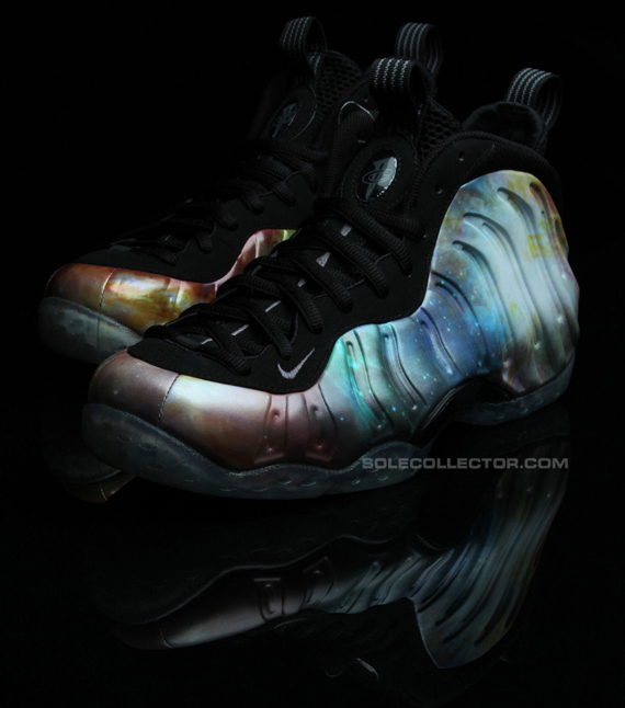
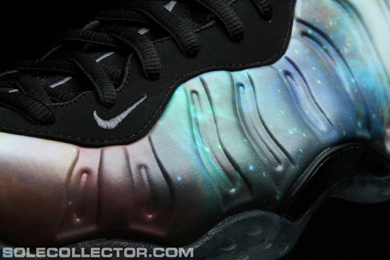
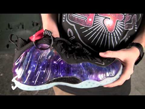
The Galaxy Foamposite One has gone thru a lot to make it to its release date of Feb 24th, 2012. We first saw images of a sample pair a few months back at a Sole Collector Event, the next “official images had everyone gassed, because we cud visibly see the stars and the “Glow in the dark sole”, making the theme make more sense, now Sole Collector is showing us a trial pair that looked a lot better, My question to you guys is..have we been tricked into thinking a ugly shoe is really the dopest of the year so far? Is this the type of shoe that looks better on the net than in person? When I had the galaxy foams in my hands for the first time I wasn’t really that excited, I was way more excited when I purchased my Metallic Reds. The Galaxy foams kinda looks like they just threw some wallpaper on the shoe, instead of making the galaxy theme flow in to the foam material of the shoe. The shoe would change colors like all the other color theme foams! Take a look at the trial sample, I think If they would have thrown the glow in the dark sole on them, it would have looked better. One thing is for sure,Thank God they didn’t go with the first sample because the tie Dye looking theme was horrible!! Check out the pics after the jump!!!
The post Galaxy Foamposite: Could It Have Been Done Better? appeared first on 8&9 Clothing Co..


